This project was completed as part of an introduction to data science course for civil and mineral engineers at the University of Toronto. I had the pleasure of completing what would become one of my favourite courses in my entire education, during the winter semester of 2021.
The purpose of this group assignment was to apply the skills acquired over the course and to go through part of the data science life cycle: cleaning data, visualizing data, and predicting with data.
Python was used throughout the course. Packages included pandas/geopandas, matplotlib, seaborn, scikit-learn, and more. Jupyter notebooks were used to include rich text in between code blocks to better guide the process. I set up Jupyter Notebooks in Visual Studio Code, for a more streamlined experience.
This post will focus on the data cleaning and modelling processes, as I did not have a hand in the visualization portion of the project.
Data Wrangling and Cleaning
The data used for this assignment was taken from Toronto's OpenData site. The dataset used includes data from Jan 2017 to Oct 2020. Hourly weather data was also used and was taken from climate.weather.gc.ca for the same period.
The full Jupyter Notebook containing the code and process for this part of the project can be viewed here.
The bikeshare data was stored as tabular data, with each file containing every trip taken during a single month. Naming conventions also changed part-way through the dataset, and many errors and invalid trips existed as well, e.g. a bike trip that lasted 0 seconds. Additionally, many rows were missing key pieces of information, such as where the trip started.
The goal here was to combine all the files into a single table, standardize the terminology used, set the proper data types so analysis could be conducted on the data set, and to attach weather and geographic information to each trip to see their impact on bikeshare usage.
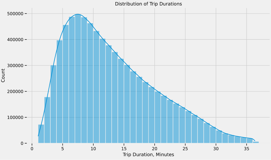
Throughout the proces, I made sure to check the validity of the data I was collating by generating a few charts, like the distribution of trip durations plot, below. Many of the trips had invalid trip durations; a trip less than 60 seconds likely wasn't valid, and a trip lasting a day likely wasn't valid, either. After removing the outliers, I found it helpful to check the distribution, to ensure I didn't accidentally mess with the valid data.
At the end of the process, I ended up with a table containing 43 columns and over 8,000,000 rows, with each row representing an individual bikeshare trip. Each trip had start and end times, as well as locations, along with full weather report.
At this point, I passed the data off to my teammates, who analyzed the data with various data visualizations to better prepare ourselves for creating a model that could predict bikeshare demand.
The full Jupyter Notebook containing the code and process for the data visualization and analysis part of the project can be viewed here.
Modelling
predicting bikeshare demand
The modelling part of the project mainly used scikit-learn, which is a machine learning library for Python.
The full Jupyter Notebook containing the code and process for modelling can be viewed here.
Feature Engineering and Selection
The process I followed involved splitting the data into 3 sets: training (70%), validation (15%), and testing (15%). The training set is used to create the prediction model, while the validation set is used to help us fit the parameters of the model. The testing set is not touched until the very end, after I had finalized the model. This is done because when the predictions are compared to the test dataset, the evaluation that results is unbiased, whereas the validation dataset had a hand in creating the model. More on this topic can be found on Machine Learning Mastery.
Because this course was an introduction, more complex models were beyond the scope of the course.
An important step in creating the model was feature engineering and selection. This is the process of taking the raw data and using domain knowledge, along with the insights that were gained during the exploratory data analysis, and creating features that more appropriately predict the desired variable. Feature selection is a process in which variables are chosen or discarded based on how they affect the model.
In this case, I was looking to predict the number of hourly bikeshare rides given a date and time, along with a few weather variables. Since the dataset contained a row for every bike trip, I grouped the data and got the past demand for every hour. Below, is the code used to aggregate the bikerides, which also passes along relevant data that could be used to predict demand, such as temperature and if the day was a holiday. The variables were selected based on insights from the previous sections of the project.
# Use named aggregation to aggregate the columns
grouped = df.groupby(df['Start Time'].dt.round('H')).agg(
    rides=('User Type', 'count'),
    annual_members=('User Type', lambda x: x[x == 'Annual Member'].count()),
    casual_members=('User Type', lambda x: x[x == 'Casual Member'].count()),
    weekday=('Start Time', is_workday),
    holiday=('Start Time', is_holiday),
    duration=('Trip Duration', np.mean),
    year=('Year', lambda x: x.iloc[0]),
    month=('Month', lambda x: x.iloc[0]),
    dayofweek=('Start Time', lambda x: x.iloc[0].dayofweek),
    hour=('Time', lambda x: int(x.iloc[0][:2])),
    temp=('Temp (°C)', lambda x: x.iloc[0]),
    humidity=('Rel Hum (%)', lambda x: x.iloc[0]),
    wind_speed=('Wind Spd (km/h)', np.mean),
    weather=('Weather', is_precipitation)
)
Model Selection
Before creating different models for the data, a way to evaluate or score them is needed. For this course, we mainly used the root-mean-square error, which is the standard deviation of the residuals, or prediction errors. A lower RMSE means that the predictions were close to the real data points.
# Create features ready for modelling
def create_features(df):
"""
Returns a dataframe with scaled and dummy encoded features
Parameters
----------
df : DataFrame
The dataframe to create features from
Returns
----------
DataFrame
DataFrame containing scaled numerical features and dummy encoded
categorical features ready for modelling
"""
scaled = df[num_features].copy()
# Scale the numerical features
scaled.iloc[:, :] = scaler.transform(scaled)
# Dummy encode categorical features
cats = [pd.get_dummies(df[s], prefix=s, drop_first=True) for s in cat_features]
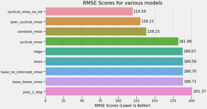
return pd.concat([scaled] + cats, axis=1).reset_index().drop('Start Time', axis=1)After creating a function that would dummy encode and numerically scale the features (seen above), I tested the various models that we learned in the course, including multiple-linear regression, ridge and lasso regression, and polynomial regression. Through my own exploration and research, I tested some models with cyclical time features, which represents time variables as functions of sin and cos. This resulted in improvements to the RMSE. A summary of the models I tested are below.
Testing the Model
I selected the model with the lowest RMSE score as the final model to evaluate against the test dataset that was set aside at the beginning. This was a linear regression model, utilizing the variables below, and did not set a y-intercept.
- Temperature
- Humidity
- Wind Speed
- Month, Day of Week, Hour (encoded as cyclical features)
The resulting RMSE from comparing the model predictions to the test data set was 117.7, which was close to the validation dataset score.
In the report, I stated that "because of the nature of linear regression models, it is possible for the model to predict values that are below 0. A prediction that is below 0 can be interpreted as 0 hourly rides, and the more negative the value, the more likely that that hour will have no demand." Treating negative values as a prediction of 0, lowered the RMSE to 68. I concluded that a linear model may not be the best model to predict hourly bikeshare demand, due to the cyclical patterns seen in the exploratory data analysis.
Closing Remarks
Overall, I found the course extremely interesting and I thoroughly enjoyed the programming aspect. I wouldn't call myself a data scientist, as I only got to dip my foot in to this field, but the skills I learned have proven useful in working with data in general, as well as bolstering my ability to work with GIS data.